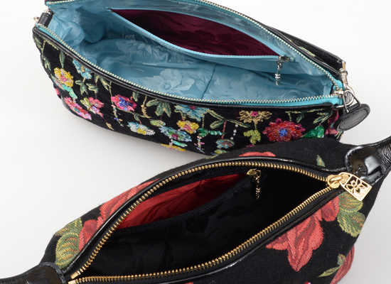


When you pick up a Think Bee! bag or wallet, first take a look inside.
Do you see a beautiful color? Next, open up the zippered pocket and peek in.
You’ll spot a different color this time.
Think Bee!’s spirit of fun and its desire to have customers join that fun is evident on the inner materials, not just the outside of the bag. Since we use different colors inside the bag, and even inside the pockets, our customers’ faces light up when they visit our stores, pick up an item, and are surprised to see the interior. Although these parts are rarely seen by anyone else, opening up a bag and seeing the bright colors makes the owner happy, and is a secret bit of fun.
Although the art of color design for interiors is rare in the handbag market, it is perfectly common in Japanese clothing design. Decorative collars, hems, and sleeves of kimono feature combinations of colors (seen only in short glimpses) for an effect called “iki,” meaning “sophistication” or “chicness.” This is Japan’s culture of “iki no bi,” and it also adds to the culture of Think Bee!, which has its roots in the Japanese fashion accessory trade. It is an important color art that allows items to stand out.
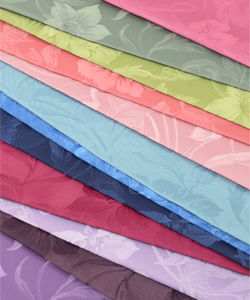
Fresh reds on black, sky blues on gray, pink on navy, and more – when a bag’s design is decided, so is the interior color scheme. Our flagship inner material is an original with brilliant, elegant coloring. The flower pattern and luster seem to float on the surface of the fabric, which is now available in 25 colors that are perfectly matched to each design. And did you know? The material also hides our original bee symbol.
Our never-ending journey to bring fun and surprise to our customers continues through our creations. Be sure to look for the bee symbol!